Tweets as postcards
Nice things that don't really work
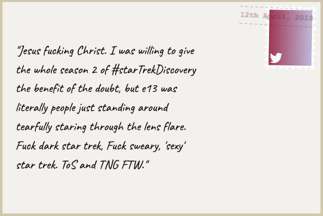
I did an experiment trying to make my old Tweet archive look like postcards. It’s a nice aesthetic if you’re on a PC, but less easily readable on mobile. This really needs to be backed out. It will, eventually.

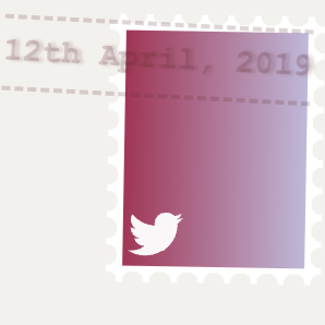
I was particularly proud of the ‘smudged’ postmark on the stamp. All done with CSS :)
Problems
I’d kept the postcards so that the text scaled with the postcard back. The problem with that, is that in tall/narrow aspect ratios - like most mobile phones, the text gets very small.
Just in case, here’s how I did the stamp though, :)
The Stamp

The HTML
    <div class="stamp">
        <span class="stamp-bg">

            <svg aria-hidden="true" focusable="false" data-prefix="fab" data-icon="twitter" role="img" xmlns="http://www.w3.org/2000/svg" viewBox="0 0 512 512">
                <path class="bird" d="M459.37 151.716c.325 4.548.325 9.097.325 13.645 0 138.72-105.583 298.558-298.558 298.558-59.452 0-114.68-17.219-161.137-47.106 8.447.974 16.568 1.299 25.34 1.299 49.055 0 94.213-16.568 130.274-44.832-46.132-.975-84.792-31.188-98.112-72.772 6.498.974 12.995 1.624 19.818 1.624 9.421 0 18.843-1.3 27.614-3.573-48.081-9.747-84.143-51.98-84.143-102.985v-1.299c13.969 7.797 30.214 12.67 47.431 13.319-28.264-18.843-46.781-51.005-46.781-87.391 0-19.492 5.197-37.36 14.294-52.954 51.655 63.675 129.3 105.258 216.365 109.807-1.624-7.797-2.599-15.918-2.599-24.04 0-57.828 46.782-104.934 104.934-104.934 30.213 0 57.502 12.67 76.67 33.137 23.715-4.548 46.456-13.32 66.599-25.34-7.798 24.366-24.366 44.833-46.132 57.827 21.117-2.273 41.584-8.122 60.426-16.243-14.292 20.791-32.161 39.308-52.628 54.253z"></path></svg>
            </span>
    </div>

    <div class="postmark">
        <time class="dt-published" datetime="2019-04-12 22:04:19 +0100 BST">
            12th April, 2019
        </time>
    </div>
I’ve got a containing <div> (not shown above) which has two children, the .stamp and .postmark divs. There’s really not much in the content here, expect some elements to hang things from. (Yes, I know I could probably have done this much more concisely, with less HTML, but I’ve already decided to back this out, so I can code-golf it later if I want to restore it).
The CSS
.postmark {
	--postmark-ink: #69333333;  /* use a partly-opaque colour */
	grid-area: 1 / 4 / 2 / 8;
	position: relative;
	time {
		font-size: 0.6em;
		font-family:'Courier New', Courier, monospace;
		transform: rotate(3deg);

		position:absolute;
		top:0.7em;
		right:1em;
		padding:0.3em 0;
		font-weight:700;
		color:var(--postmark-ink);
		border-top: dashed 0.15em var(--postmark-ink);
		border-bottom: dashed 0.15em var(--postmark-ink);
		/* make the text look 'smudged' */
		text-shadow: 2px 0 2px var(--postmark-ink);
	}
}

.stamp {
	transform: rotate(1deg);
	font-size: 1em;
	width: 4em;
	height: 5em;
	grid-area: 1 / 7 / 2 / 8;
	aspect-ratio: 4/5;
	position: relative;
	right: .3em;
	top: 0.3em;
	background-image: radial-gradient(transparent 0px,
			transparent 0.2em,
			white 0.2em,
			white);

	/*reducing the gradient size*/
	background-size: 0.5em 0.5em;
	/*Offset to move the holes to the edge*/
	background-position: 0.75em 0.24em;
	display: flex;
	.stamp-bg {
		background:linear-gradient(90deg, rgb(170, 64, 96) 0%, rgba(198,193,223,1) 100%);
		flex:auto;
		margin:0.3em;
		position: relative;

		svg {
			height: 1em;
			width: 1em;
			position: absolute;
			bottom: 0.1em;
			left: 0.1em;

			.bird {
				fill: rgba(255, 255, 255, 0.954);
			}
		}
	}
}
I’ve also made a Codepencodepen.io if you want to see a live version and mess about with it.
Things you could do
Put another background image in the stamp, like a commemorative thing. Try some different aspect ratios.

Tweets as postcards
Nice things that don't really work
an LRG Sisyphean task
Cover image: